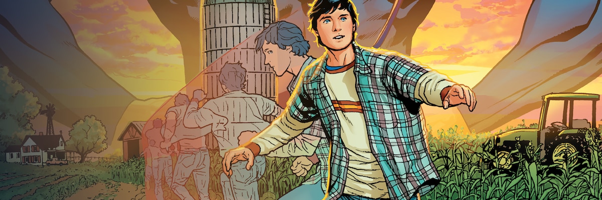
Summer of Superman
WHATEVER HAPPENED TO
THE BOY OF TOMORROW?
Did Clark Kent first start fighting for justice as a teenage Superboy? Well, yes...and no...and yes...


FEATURED VIDEO
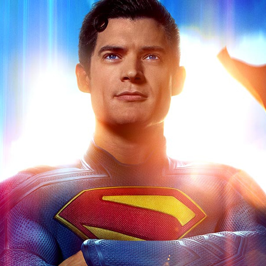
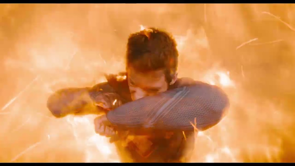
SUPERMAN – TICKETS ON SALE NOW
On July 11, the entire world will look up. Get tickets now for Superman – Only in Theaters and IMAX.
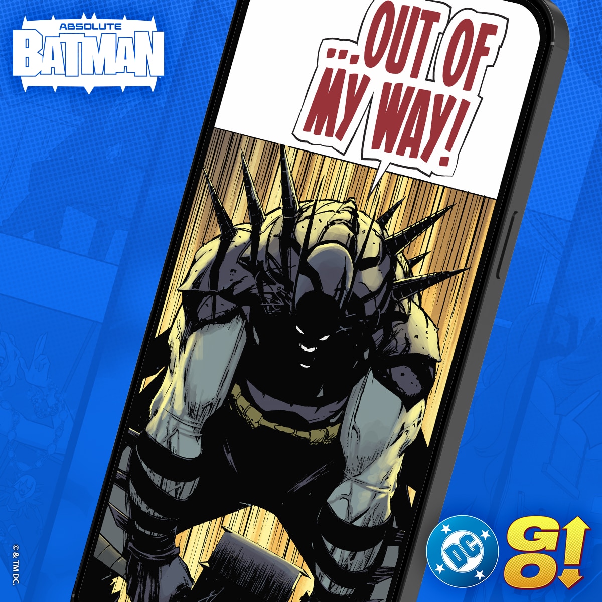
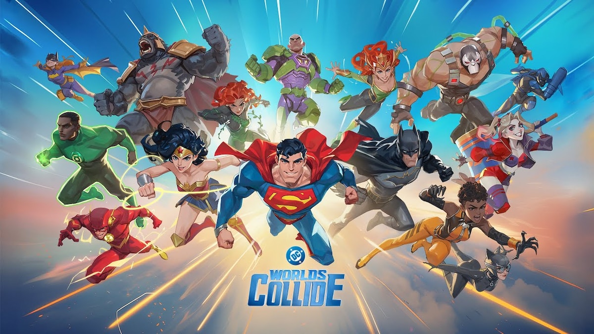
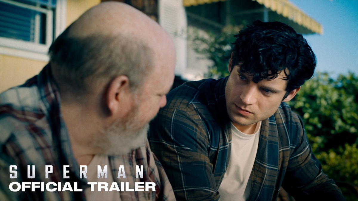
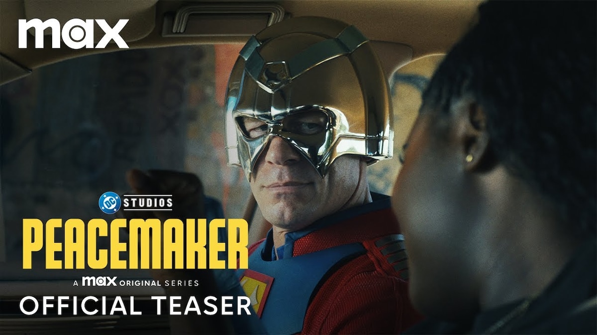
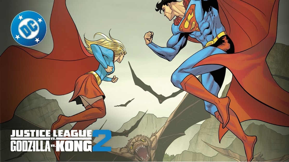
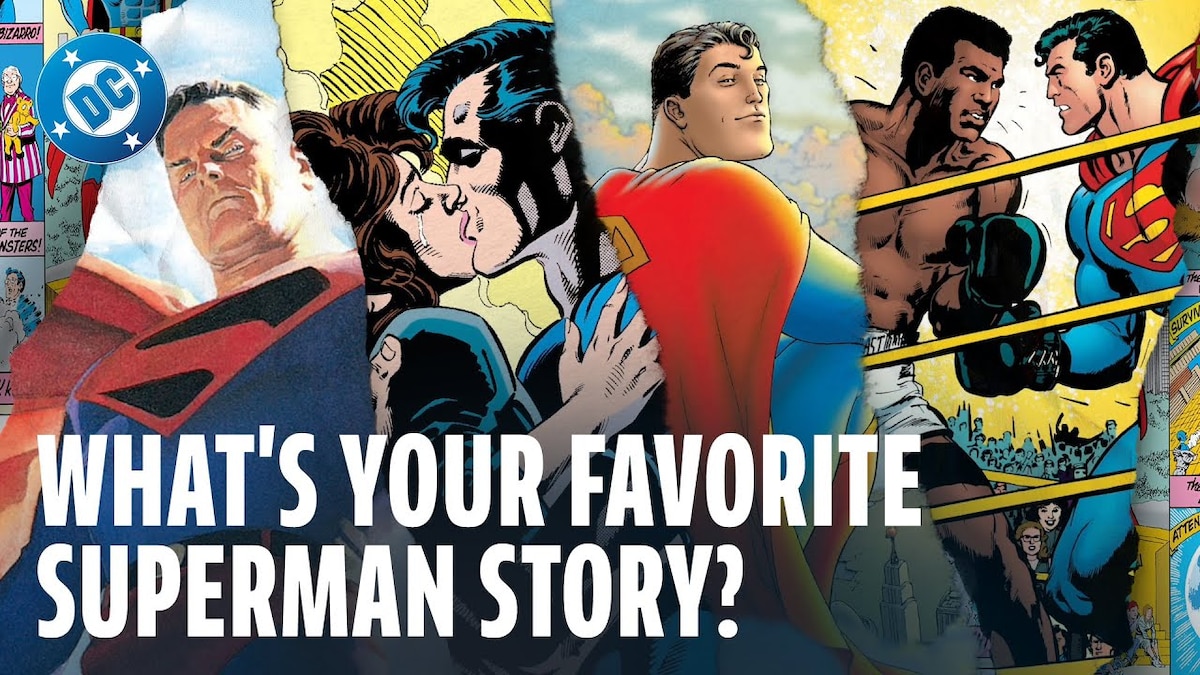
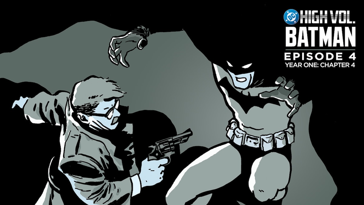
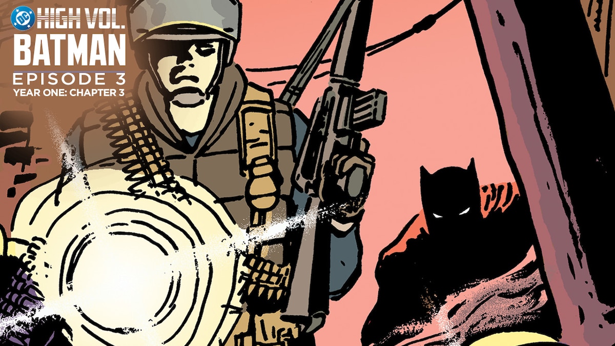
LATEST DC TRAILERS, CLIPS & MORE


NEW & TRENDING PRODUCTS FROM DC SHOP
NEWS FROM AROUND THE MULTIVERSE


JOIN THE DC UNIVERSE
Register for FREE to access member-exclusive content and activities, read FREE comics from DC UNIVERSE INFINITE, and get alerts and early access to exclusive products from DC Shop!