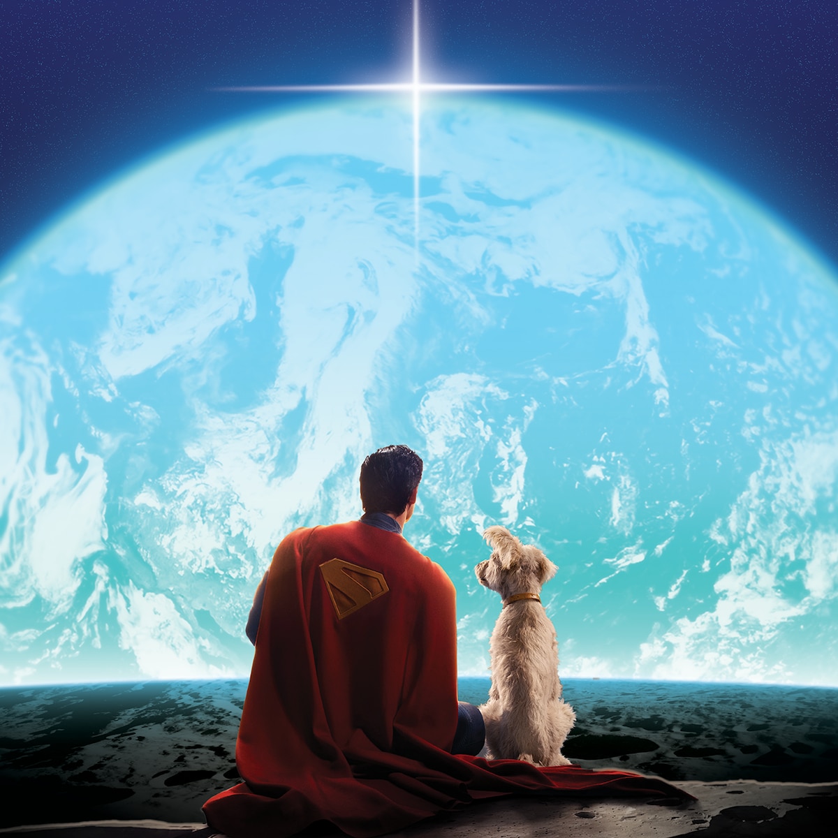
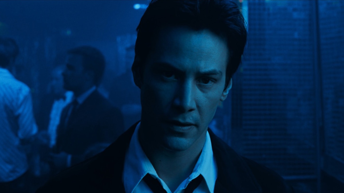
KRYPTO, TAKE US HOME...
Check out an extended sneak peek of Superman – Only in Theaters July 11.

FEATURED VIDEO
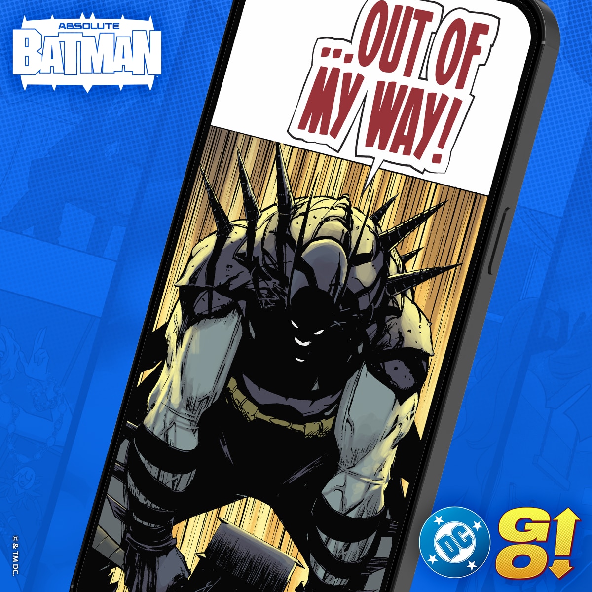
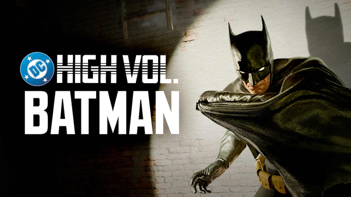
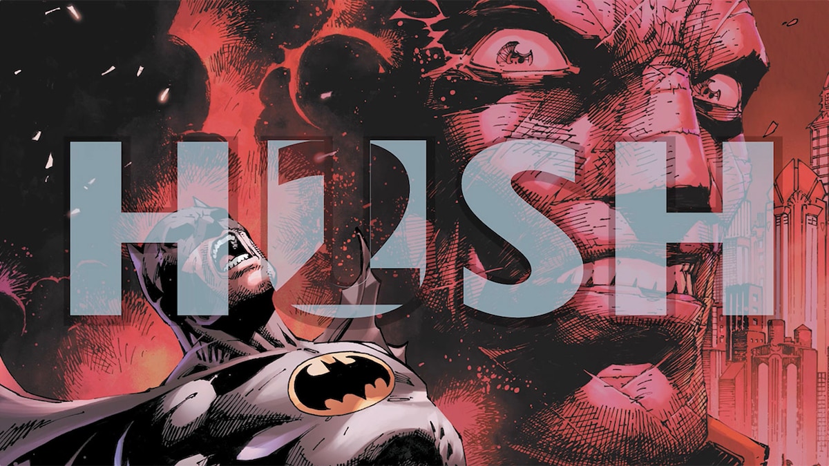
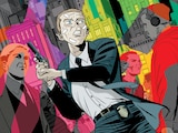
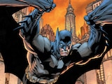
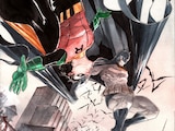
DC HIGH VOLUME: BATMAN – EPISODE 1
Dive into the shadows of Gotham City as Bruce Wayne’s transformation into the Dark Knight begins. Returning home for the first time in years, Bruce combats his own demons while struggling to topple the corrupt political system infesting his city. Meanwhile, young police lieutenant Jim Gordon arrives in Gotham with a similar mission in mind. This episode is based on Batman #404 (Jan. 1987) written by Frank Miller with artwork by David Mazzucchelli. © & ™ DC.
Listen to DC High Volume: Batman: https://lnk.to/DCHighVolume
LATEST DC TRAILERS, CLIPS & MORE


NEW & TRENDING PRODUCTS FROM DC SHOP
NEWS FROM AROUND THE MULTIVERSE


JOIN THE DC UNIVERSE
Register for FREE to access member-exclusive content and activities, read FREE comics from DC UNIVERSE INFINITE, and get alerts and early access to exclusive products from DC Shop!