Pride Month
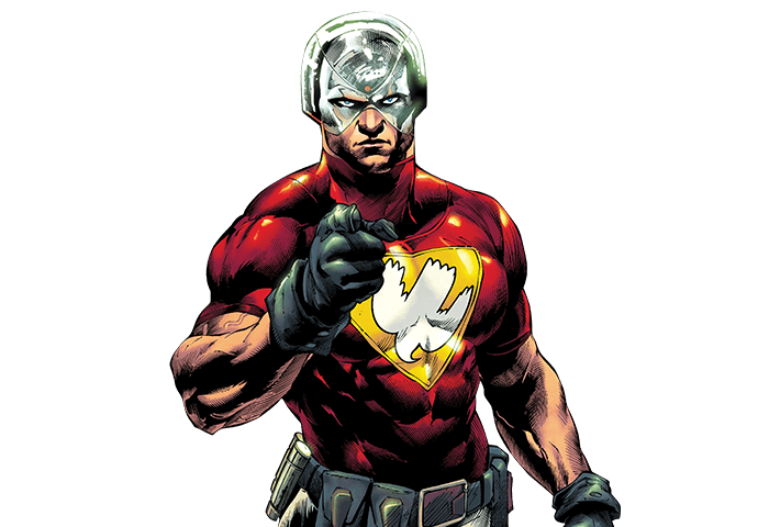
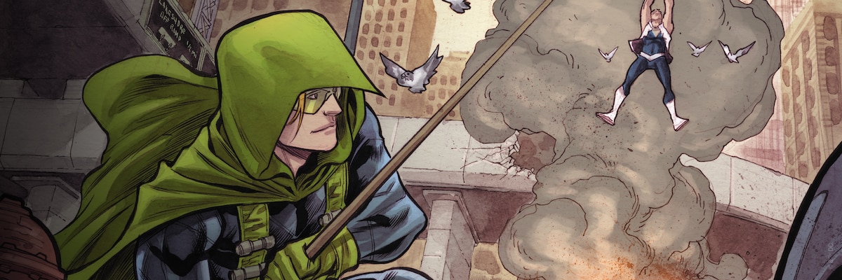
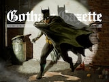
HOW PIED PIPER AND THE
FLASH BROKE DOWN DOORS
In 1991, a short rooftop conversation between the two former enemies changed the DC Universe forever.


FEATURED VIDEO
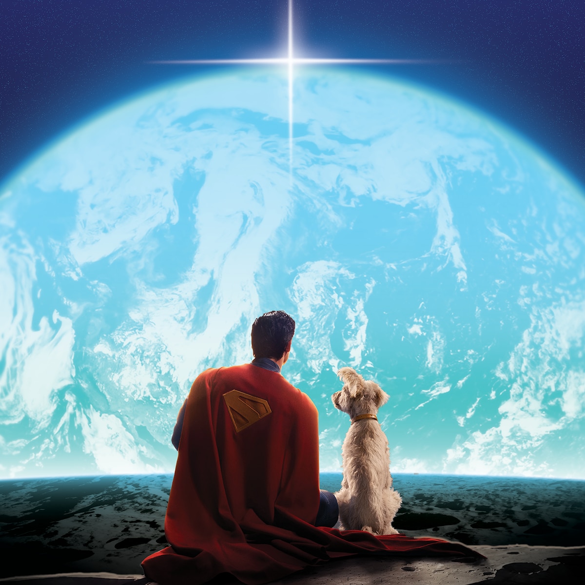
SUPERMAN – OFFICIAL TRAILER
Your choices, your actions, that’s what makes you who you are. Superman – Only in Theaters and IMAX July 11.
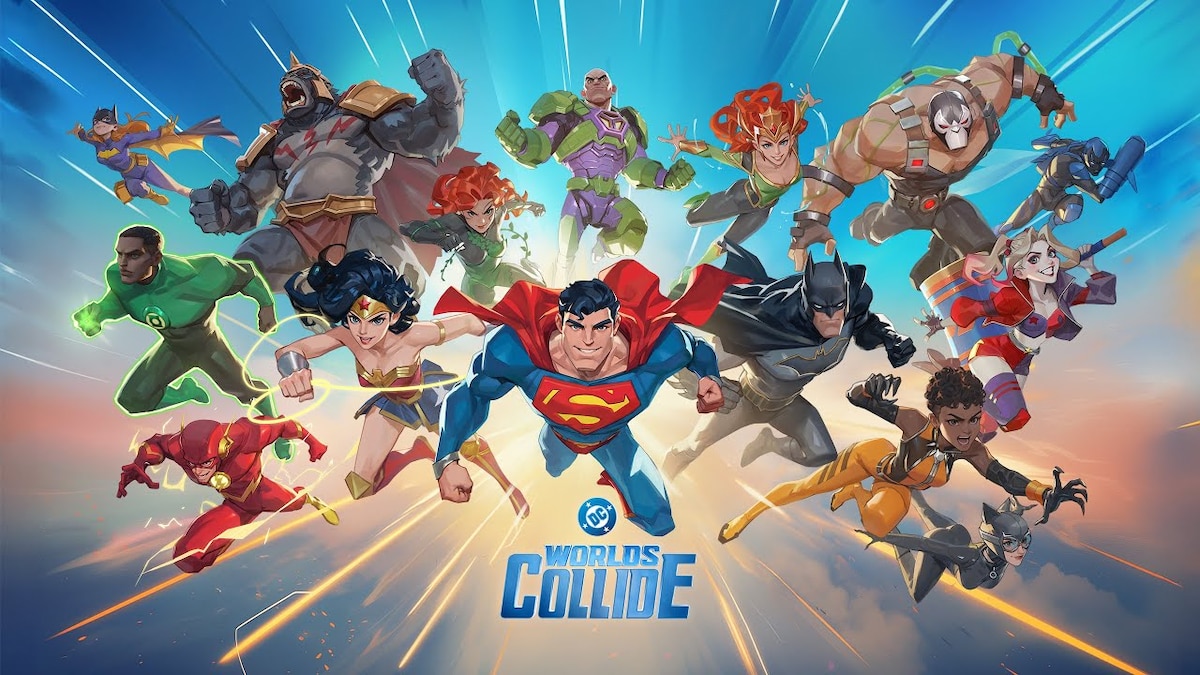
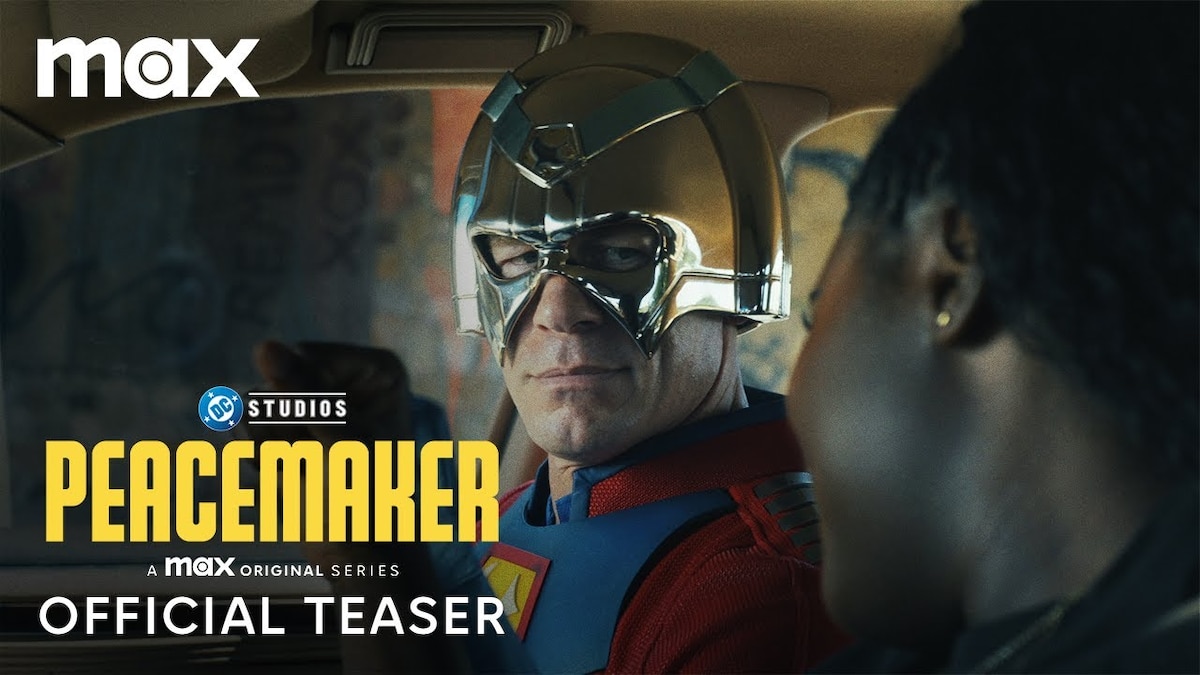
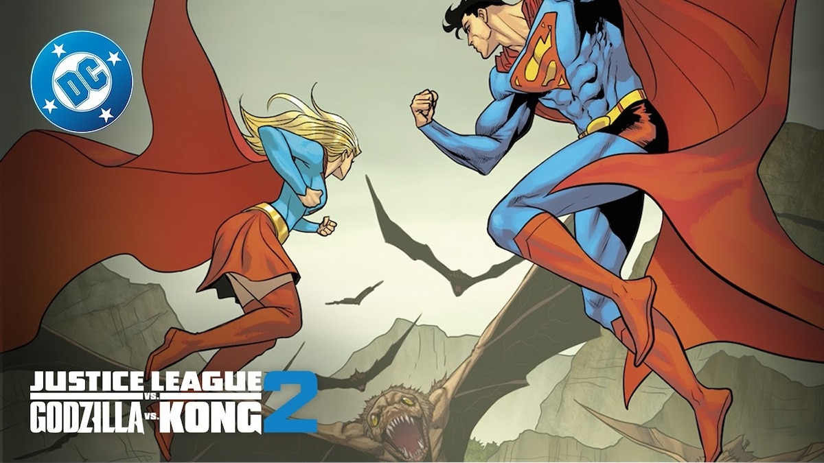
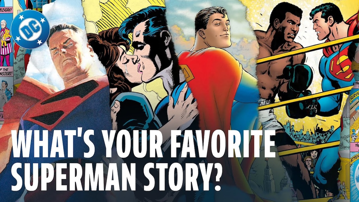
LATEST DC TRAILERS, CLIPS & MORE


NEW & TRENDING PRODUCTS FROM DC SHOP
NEWS FROM AROUND THE MULTIVERSE


JOIN THE DC UNIVERSE
Register for FREE to access member-exclusive content and activities, read FREE comics from DC UNIVERSE INFINITE, and get alerts and early access to exclusive products from DC Shop!